
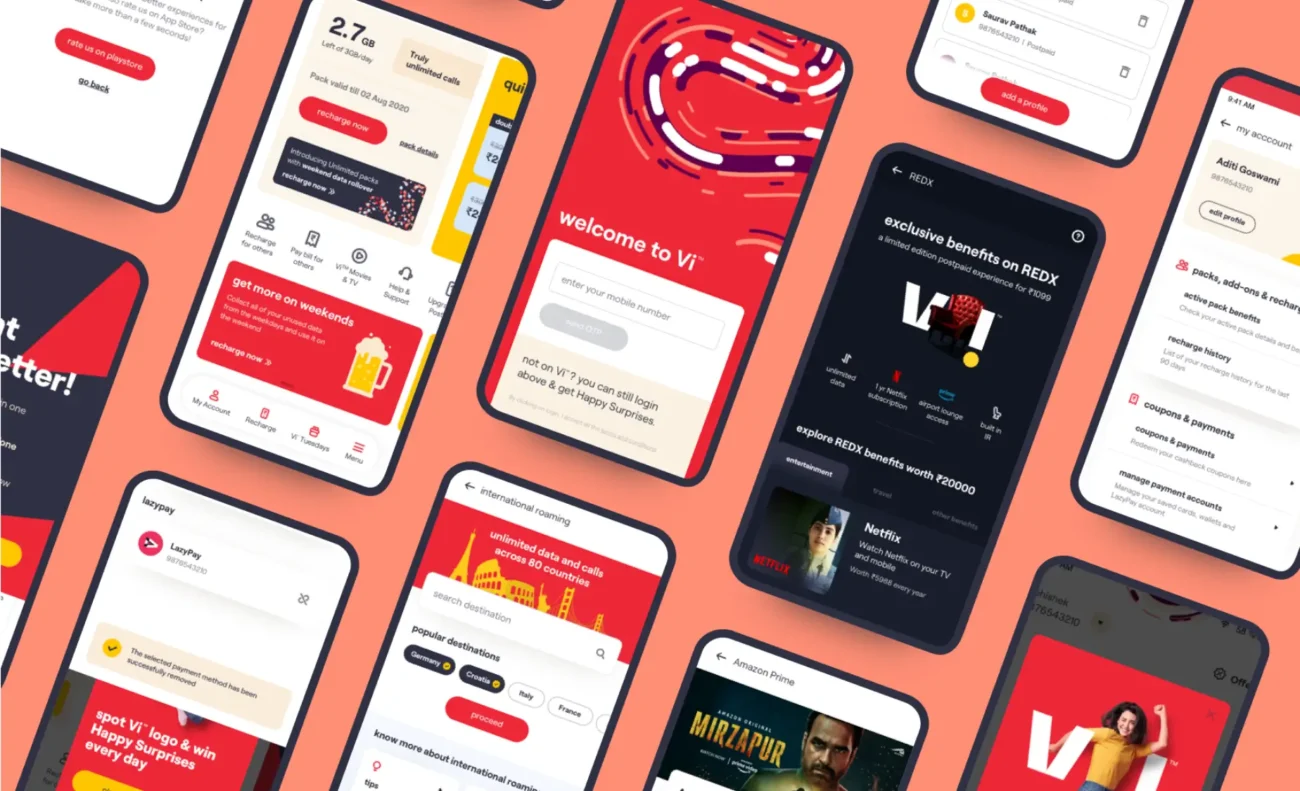
Open a website on your laptop. Now check it on your phone. If the layout breaks, text looks too small, or you find yourself pinching and zooming, that website just failed the responsive test.
In today’s world, people don’t browse the internet on one device—they switch between phones, tablets, laptops, and even smart TVs. A website that only looks good on a desktop is a website that loses half its audience. That’s where responsive web design comes in. At MindBoxx APAC, we believe responsiveness isn’t a design choice anymore—it’s the standard for any serious business.
What is Responsive Web Design?
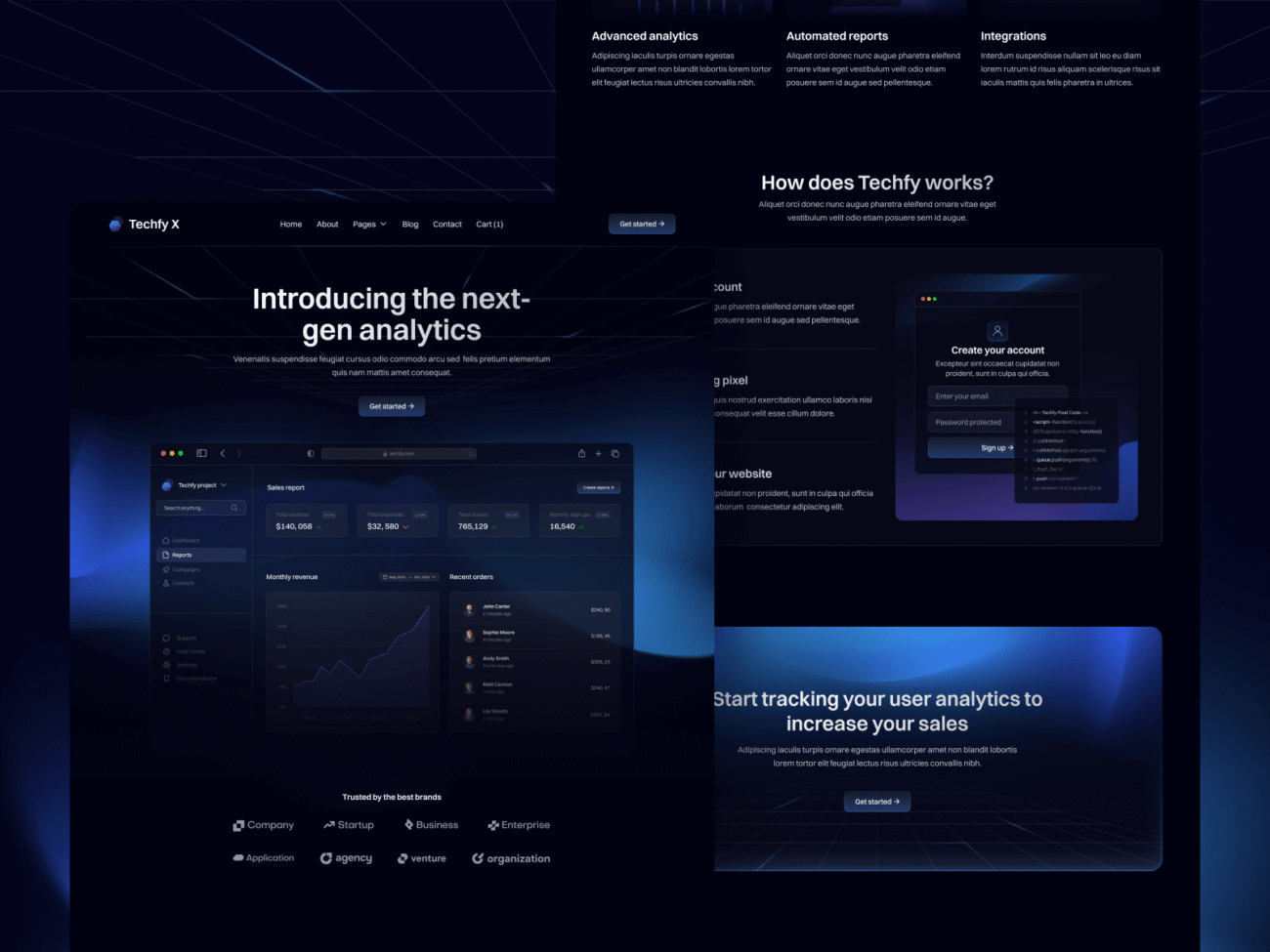
Responsive web design is an approach where websites automatically adjust their layout and elements to fit different screen sizes and devices. Instead of creating separate versions for desktop and mobile, one design adapts fluidly to all.
This means:
- Text is always readable.
- Buttons are always clickable.
- Images scale without distortion.
- Navigation remains smooth and user-friendly.
In short, it’s one website that works everywhere.
Why Responsive Design Matters
A non-responsive website isn’t just inconvenient—it’s costly. Businesses lose opportunities when users leave frustrated. Here’s why responsive web design services are critical:
- Mobile-first users: Over 60% of global web traffic comes from mobile devices.
- SEO ranking: Google prioritizes mobile-friendly websites in search results.
- User trust: A seamless browsing experience builds credibility and professionalism.
- Higher conversions: Users are more likely to stay and take action when the site feels natural.
- Future-proofing: New devices are released constantly, and responsive design adapts automatically.
If your website isn’t responsive, you’re not just behind—you’re invisible to a large part of your audience.
Common Problems Solved by Responsive Web Design
- Problem 1: High Bounce Rate on Mobile
Visitors leave because the site isn’t mobile-friendly.
Solution: A responsive layout ensures mobile users enjoy the same smooth experience as desktop users. - Problem 2: Inconsistent Branding Across Devices
The site looks polished on one device but broken on another.
Solution: Consistent design builds trust and strengthens brand identity everywhere. - Problem 3: Costly Maintenance of Separate Sites
Managing desktop and mobile versions doubles work.
Solution: One responsive website reduces costs and simplifies updates.
MindBoxx APAC Approach to Responsive Web Design
We treat responsive design as more than resizing—it’s about creating experiences that feel natural on every device. Our approach includes:
- Mobile-first strategy – designing for small screens first, then scaling up.
- Fluid grids and flexible layouts – so elements adapt smoothly.
- Optimized images and assets – ensuring speed without sacrificing quality.
- Device and browser testing – to guarantee consistency everywhere.
- User-centered design – because responsiveness is not just technical, it’s about usability.
The result? Websites that look stunning and perform flawlessly, no matter where they’re viewed.
The Business Value of Responsive Web Design
Companies that invest in responsive design see measurable benefits:
- Improved SEO visibility
- Reduced bounce rates
- Better user engagement and time spent on site
- Higher conversion rates
- Stronger customer loyalty
It’s not an expense—it’s a growth multiplier.
The Future of Responsive Design
As devices evolve, so will responsive web design. Key trends to watch include:
- Adaptive typography that changes not just size but readability.
- Voice-first design for screenless interactions.
- Accessibility-driven responsiveness ensuring inclusivity for all users.
- Dark mode responsiveness adapting to user preferences.
The future is about websites that don’t just resize, but truly respond to user needs.
Conclusion: One Website, Every Device
Your customers aren’t sitting at one desk. They’re browsing on the go, comparing on phones, and deciding on tablets. If your website can’t keep up, you risk losing them to a competitor that can.
At MindBoxx APAC, our responsive web design services ensure that your website not only looks great everywhere but delivers consistent, seamless experiences that build trust and drive results.
Because in today’s digital world, it’s not enough to have a website—you need a website that works everywhere.

Leave a comment